Flying the Freak Flag
This week I stumbled upon the concept of prefectural flags for the first time. Ordinarily that wouldn't excite me, but because most of Japan's prefectural flags feature kanji or kana, I perked up immediately. It intrigued me further that I could recognize almost none of the text on the flags. The writing has been stylized to such a degree that it's hard to see how the emblems correspond to Japanese at all.
Now, I realize that flags fall squarely into geek territory. After all, I know no bigger flag enthusiast than Dr. Sheldon Cooper of The Big Bang Theory, and I wouldn't want to come across sounding like that vexillologist. But letting one's own freak flag fly is supposed to be the height of personal freedom, so I'll hoist mine high here.
Besides, even if vexillologists are dorky, the flags themselves aren't. On the contrary, just consider how striking they are in From up on Poppy Hill.
Those colorful symbols grab our attention throughout the movie. In a similar way, prefectural flags stand out, but it's for a different reason. They have an unusual palette, including orange, purple, aquamarine, and brown. No matter how unconventional those choices might be for flags, they're sure to look better than the hideous flag of Maryland, a cringeworthy aspect of my childhood.
Enough introductory comments! Let's try a quiz. Match the flags below with the characters from the lettered list. While you're at it, associate those kanji with the definitions in the last list. The flag part is just for fun. The rest of the quiz is dead serious, and there will be major consequences if you make a mistake!
1.  |
a. 岐 | i. soldier |
2.  |
b. 岩 | ii. god |
3.  |
c. 神 | iii. rock |
4. 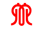 |
d. 兵 | iv. to diverge |
I'll block the answers with the flag of Tochigi Prefecture:

As I learned while writing the newest essay on 栃 (Japanese horse chestnut tree), the rounded parts of this emblem represent a stylized version of 栃. Meanwhile, the three arrowheads on the upper left allude to the ancient style of writing 木 (tree). The flag supposedly represents improvement and active motion.
Okay, now for the answers.

1.b.iii. This teal flag hails from Iwate (岩手, いわて) Prefecture and presents 岩 (rock, boulder), which symbolizes advanced progress. Hmm, do you associate rocks with swift progress?

2.d.i. This light blue flag from Hyogo (兵庫, ひょうご) showcases 兵 (soldier). The emblem also represents the stylized map of the prefecture, which faces both the Seto Inland Sea and the Sea of Japan, as one map shows.

3.a.iv. This flag from Gifu (岐阜, ぎふ) looks like it contains text, but I would never have seen the mazelike form as 岐 (to diverge). The emblem expresses peace and harmony, and the green stands for the nature of Gifu.

4.c.ii. This loopy shape symbolizes Kanagawa (神奈川, かながわ) and features 神 (god). A much more famous flag also consists of red and white, the Japanese national colors. Of course, it makes sense to find those on the national flag. As for Kanagawa, its seaport in Yokohama has long served as a major gateway into Japan, so the national colors seem appropriate here, too.
All this material comes from a Wikipedia page in English, where you'll also find the following nuggets:
 |
 |
• Both Ishikawa (石川, いしかわ) and Yamaguchi (山口, やまぐち) feature the whole prefecture name on their flags. This is a departure from the pattern we've seen thus far, wherein only the first kanji makes it into the emblem.
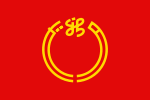
• The red Niigata (新潟, にいがた) flag also presents the whole name, but it does so with a combination of kanji and kana. That is, the emblem includes 新 (new), which corresponds to the にい of にいがた. (That kanji has three Joyo yomi, including にい.) The ガ corresponds to the left half of the circle, and タ corresponds to the right half. It's too bad that they finished off がた that way. I'm partial to 潟 (lagoon), a shape that's beautiful and interesting while being a straightforward representation of -がた (as when -潟 appears at the end of lagoon names).

• The Oita (大分, おおいた) flag contains not one but three representations of 大 (big). Those kanji do double duty, also symbolizing flying birds. And the whole emblem signifies the sun! So ... aren't the birds headed straight for each other, as well as into the burning core of the sun?!
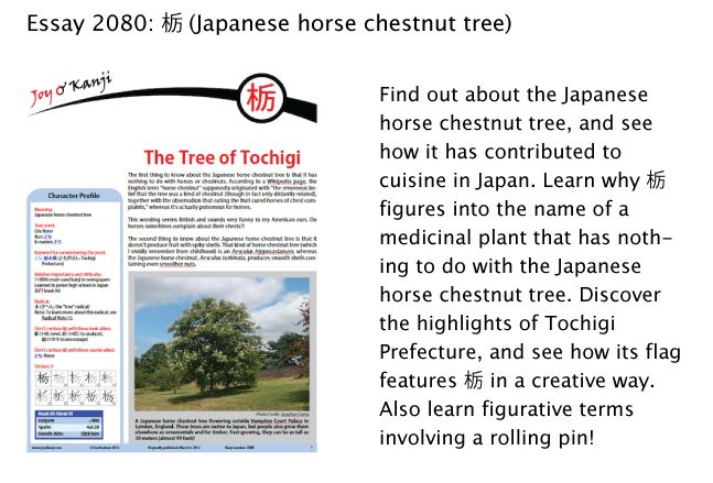
If you find it overwhelming to consider so many prefectures, retreat to quiet Tochigi with its cedars, Japanese maples, hot springs, ancient shrines, and temples. To get a good handle on its most important kanji, check out the 栃 essay:
Have a great weekend!

Comments